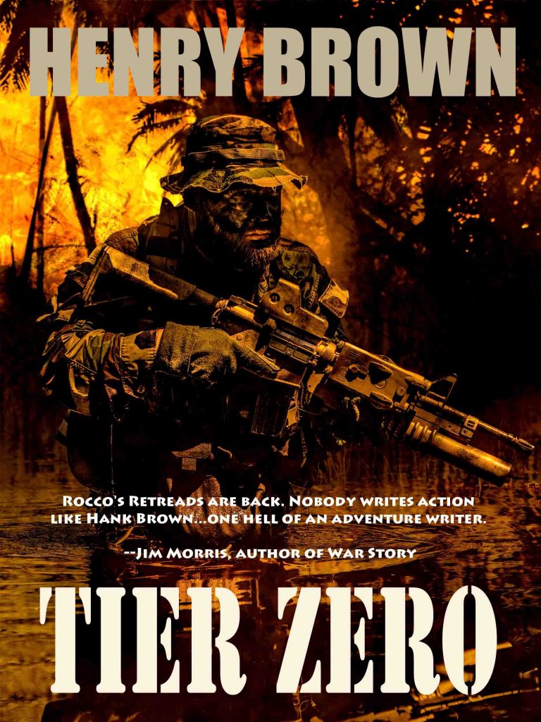
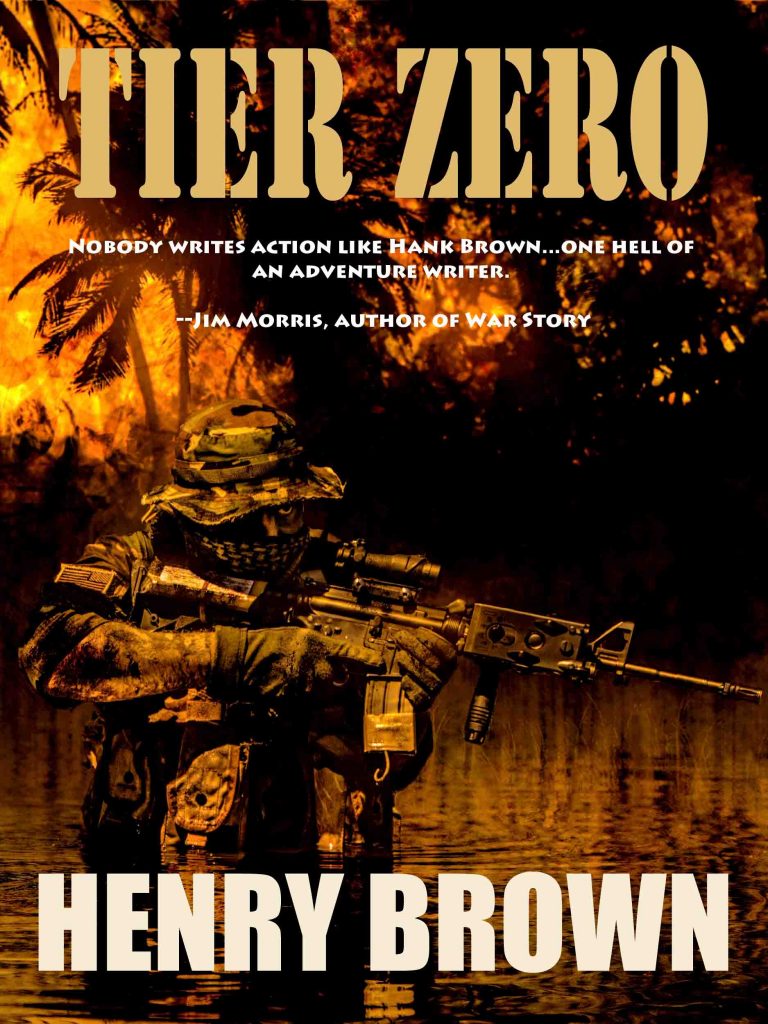
I could use some feedback on these covers. I plan on replacing my cool retro-men’s adventure cover for the E-book version of Tier Zero…at least temporarily.
Here’s Alternative 1:
And here’s Alternative 2:
I’m having trouble deciding which I like better. Any constructive criticism would be helpful. Shouldthe font be more like it is in the other books of the series? Do you think the overall tint should be tweaked to the muddy, muted colors of the other books? (I know the weapons and gear don’t reflect exactly what’s in the story–this is more an attempt at a striking image that connotes, thematically, the content in a general sense.)


